 Powered by Econ-ARK
# Some initial setup
from matplotlib import pyplot as plt
import numpy as np
#plt.style.use('seaborn-darkgrid')
plt.style.use('seaborn-v0_8-darkgrid')
import pandas as pd
import datetime
import seaborn as sns# Import Quarterly data from FRED, reading each series' CSV download directly
def fred(series, start, end):
url = f"https://fred.stlouisfed.org/graph/fredgraph.csv?id={series}"
return pd.read_csv(url, index_col=0, parse_dates=True).loc[start:end]
start = datetime.datetime(1947, 1, 1) #beginning of series
start1 = datetime.datetime(1956, 10, 1) #beginning of series
end = datetime.datetime(2018, 4, 1) #end of series
PCDG = fred('PCDG', start, end) #loads your durable goods quarterly series data
PCND= fred('PCND', start, end) #Loads your non durable goods quarterly series data
PCDG1 = fred('PCDG', start1, end) #loads your durable goods quarterly series data, helps in having time series of identical length
PCND1= fred('PCND', start1, end) #Loads your non durable goods quarterly series data, , helps in having time series of identical length# Constructing PCDG and PCND growth series ()
z1=PCDG.pct_change(periods=40)# 10*4
z2=PCND.pct_change(periods=40)#10*4
z3=PCDG1.pct_change(periods=1)#
z4=PCND1.pct_change(periods=1)#
s1=z1*100 #(In percentage terms)
s2=z2*100 #(In percentage terms)
s3=z3*100 #(In percentage terms)
s4=z4*100 #(In percentage terms)# Plotting the growth rates
plt.figure(figsize=((14,8))) # set the plot size
plt.title('Durables vs Non Durables Growth 10 year vs Quarterly')
plt.xlabel('Year')
plt.ylabel(' Growth (Percentage Terms)')
plt.plot(s1,label="PCDG 10 year growth")
plt.plot(s2,label="PCND 10 year growth")
plt.plot(s3,label="PCDG quarterly growth")
plt.plot(s4,label="PCND quarterly growth")
plt.legend()
plt.show()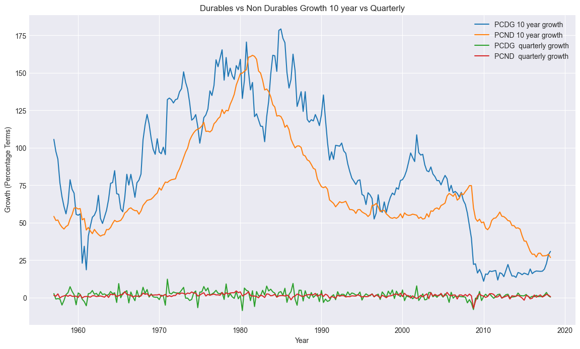
# Drops the missing NAN observations

a1=s1.dropna()#Drops the missing values from s1 series
a2=s2.dropna()#Drops the missing values from s2 series
a3=s3.dropna()#Drops the missing values from s3 series
a4=s4.dropna()#Drops the missing values from s4 series
# concatate (merge) the two series
c1=pd.concat([a1, a2], axis=1)
c2=pd.concat([a3, a4], axis=1)#Pairwise Plotting for the 10 year growth series
sns.pairplot(c1)
plt.suptitle('10 Year Growth Rates')
plt.show()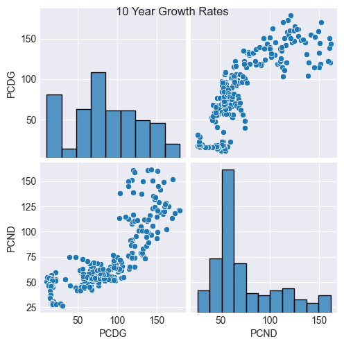
#Pairwise Plotting for the quarterly growth series

sns.pairplot(c2)
plt.suptitle('1 Quarter Growth Rates')
plt.show()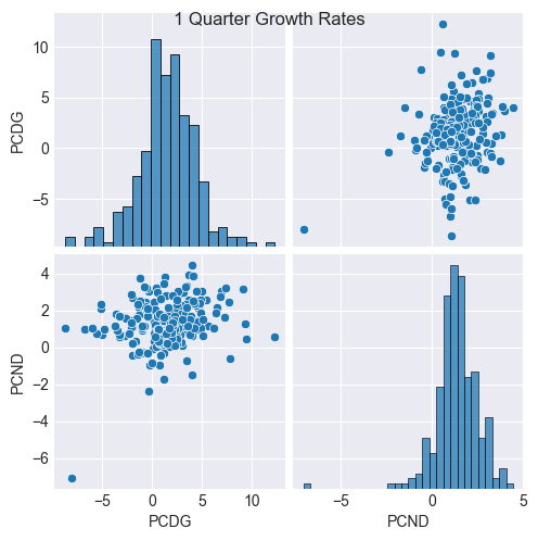
For each frequency [quarterly|10-year] each moment of time would correspond to a single point (x=nondurables growth, y=durables growth). Such a plot shows that at the 10 year frequency, there is a very strong relationship between the two growth rates, and at the 1 quarter frequency, much much less.